Customise Checkout
Establishing the Checkout is nearly the easiest way of communicating with your Customers. The Checkout customisation speaks for your brand and can make it much more familiar to everyone involved in the payment process.
Thus, here are some tips and instructions on how to customise your Checkout most effectively:
Apply Styling to your Checkout
- Go to Merchants and choose the Merchant account on the grid.
- Navigate to the Checkouts tab and select the Checkout you want to proceed with.
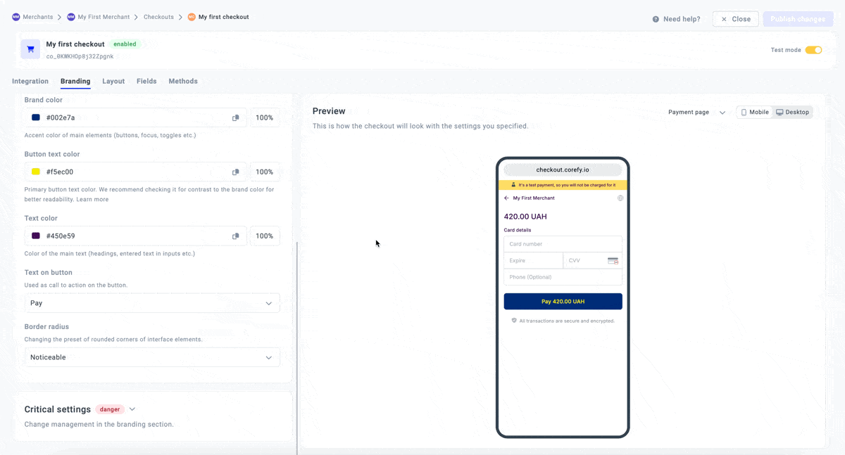
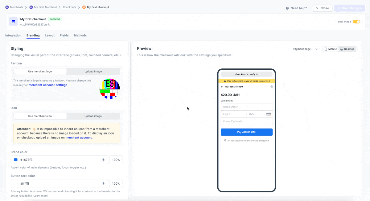
- Then, go to the Branding tab and scroll to the Styling section to change the interface visuals.
| Branding element | Styling option → applied | Description |
| Tab title | Default | Tab title is the text displayed on the browser title bar or in the tab of the given page. It is used for the most customised user experience and boosts overall brand recognition. The Default option presupposes adding text with a defined structure, namely: Merchant account name + the word ‘Checkout'. For example: Merchant account name – Corefy |
| Custom | The Custom option allows you to manually enter the Tab title text in the related text field based on your preferences. Precondition: the number of characters should be more or equal to 3 and less or equal to 64 |
|
| Image | Favicon | The options allow you to add a Favicon & Icon to Checkout to familiarise your Customers with your brand identity:
|
| Icon | ||
| Mode | Auto |
The option determines the visual theme mode applied to Checkout:
|
| Light only | ||
| Dark only | ||
| Colour | Brand colour | The options determine the colours visualized at Checkout:
|
| Button text colour | ||
| Text colour | ||
| Text | Text on button | The option determines which button text to display:
|
| Font | The system sets an Inter font by default. To change the Font, click the respective dropdown list and select a specific option from the provided:
|
|
| Border radius | The option allows you to moderate the form of the interface elements:
|
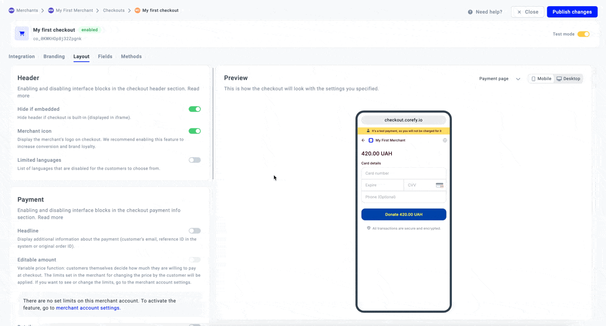
Manage the Layout options
- Select the Checkout and navigate to the Layout tab.
- It contains the list of features and blocks that can be presented on your Checkout after you click the appropriate toggles.
- Here is a brief overview of the blocks and the included features:
| Block name | Feature → switched on | Description |
| Header | Hide if embedded | The option allows you to hide the Header if the Сheckout is displayed in the iFrame. |
| Merchant icon | You can manage the Merchants logo at Checkout to familiarise your Customers with the branding. | |
| Limited languages | It covers the list of languages Customers should not have access to:
|
|
| Separate selectors | The option controls how language and location settings are displayed on the Checkout page.
|
|
| Payment | Headline | It covers the additional Customer information regarding the payment: email, reference ID, and original order ID. |
| Headline type | The type defines the information that should be displayed above the Payment amount specification.
|
|
| Details | It covers the block of information containing the payment details with the optional data in the Request. | |
| Fields | Customer fields | It enables displaying the block of Customer fields. To arrange the field properties, go to the Fields tab. |
| Required for express methods | The option enables displaying Express methods under Customer fields at Checkout. | |
| Methods | Saved methods | It covers the block with the Saved methods and allows you to manage and reorder them. However, to configure the properties that should be displayed, go to the Methods tab. |
| Hide expired cards | The option presupposes hiding the expired cards automatically. | |
| Footer | Trusted info | It displays a label in the Footer mentioning that all the transactions are secure and encrypted. |
- To review all the established changes, reassess them in a Preview mode. If everything looks as intended, click Publish changes or continue editing the current version of the given Checkout.
Review Critical settings
- Select the Checkout and scroll to the Critical settings section.
- To return branding updates to the original version of the given Checkout, click Roll back changes.
- To reset branding updates to the default state, click Reset to default.